I am going to attempt to change forever the way you think about
marketing campaigns, but I need your help:
I need you to suspend disbelief for a few paragraphs,
Let's think about a direct marketing campaign intended
to stimulate purchase of a particular product—Product X.
We'll make it very clean, by assuming our goal is simply
to get people to purchase Product X within one month of the campaign drop.
We get to choose whether to include each customer in the campaign,
and each customer either does or does not purchase Product X.
Of course, customers can buy Product X even if
they're not included in the campaign.
As rational marketers, our goal is to generate incremental sales,
i.e. ones that would not have occurred without the campaign.
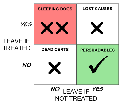
Now let's segment these customers into four groups as follows.
- The Persuadables.
These are the people who only buy the product if we include
them in the campaign.
They are our true targets.
- The Dead Certs.
This group buy the product whether or not
we treat them.
Think of the people who queue for days to be the first
to get a new games console.
- The Lost Causes.
Like the Dead Certs, the Lost Causes are completely
unaffected by the campaign—the difference is that
whether or not we treat them, they don't
buy.
- The Boomerangs.
We have to accept, at least in principle,
the possibility that there is fourth group—people
who only buy if we don't include them in the
campaign.
You may be skeptical that this last group exists,
but for now at least accept their logical possibility.
One name for this group is the Boomerangs,
because—metaphorically—they come back and
hit you in the face if you target them.
I'm not a great fan of Boston Boxes, but this does seem like
a case screaming out for one, so here it is.

If our goal is truly to maximize the return on our marketing investment,
and if we assume for now, that there are no side effects
(warm fuzzy feelings generated by being given an offer, even if you
don't take it up—that sort of thing),
it is clear that the ideal targeting strategy would be to treat
only the Persuadables.
That way, if you treat 100,000 people, you get 100,000 incremental sales,
which is perfect.
(I know, I know, people could buy two. Or Seventeen.
And they could tell their friends.
And you could win the lottery three weeks running…)
If you've hung in this long, there are a couple of obvious big questions.
One is whether the “Boomerangs” actually exist.
The other is whether we can identify these groups,
even if we accept, in principle, that they must (or might) exist.
I'll tackle the first of these today;
the other will be the subject of a separate, future post.
Boomerangs, Sleeping Dogs, Triggered Cancellation and Negative Effects
There is one case in which the existence of Boomerangs
(people for whom the marketing campaign has the reverse of the
desired effect) is both simple to demonstrate and easy to
understand—the case of retention activity.
My company, Portrait,
has seen numerous cases of retention campaigns that increase
the rate of customer loss in certain segments, and in some cases
actually increase it overall.
This is not as strange as it may seem.
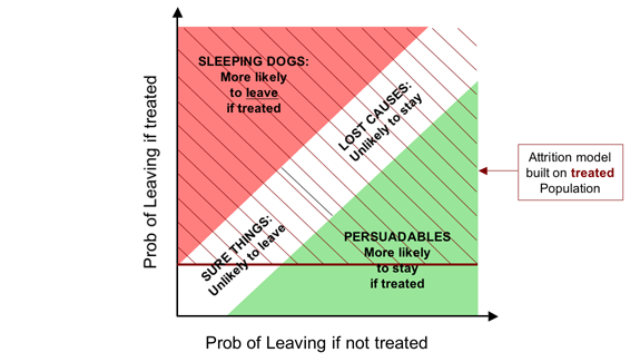
The mainstream state-of-the-art approach to customer retention
for contract-based products (e.g. phone contracts, insurance policies,
and fixed-term loans)
is first to build a model of how likely people are to fail to renew.
In the communications industry, such models are called “churn models”,
while in financial services they are normally known as “attrition models”.
In the simplest case, people with a high modelled propensity to leave
are targeted with a retention action.
A more sophisticated approach weights the attrition probability
with an estimate of customer value,
so that retention activity focuses more on revenue (or profit)
at risk than on customers per se.
It's obvious that there is a strong correlation between a customer's level
of satisfaction with a service and his or her likelihood of renewing.
So modelling attrition probability is pretty similar to predicting
dissatisfaction, i.e. the customers most commonly targeted by the
standard approach are those who are unhappy with the provider.
Many of us, however, are lazy. Even though I might hate my phone
provider or insurance company, there's a good chance that I won't,
make the effort to dig out a number and call them up to
cancel. It's just too much hassle.
But what if that company takes the trouble to call me up just before
my renewal is up?
Needless to say, this removes a crucial obstacle to my cancelling,
and there's a very good chance I'll say “Ah, I don't suppose just
cancel right now is there?”
Especially if the call itself annoys me, as is the case for many people.
We have overwhelming evidence that such triggered cancellation
is a real and common phenomenon.
Boomerangs definitely exist in many, if not most, retention
campaigns, though I tend to think of this segment more as
“Sleeping Dogs” who are best left to lie.
(Though my colleague, Neil, tells me that in Liverpool the phrase
is “Don't let sleeping dogs lie.” What can I say?)
But even where such Sleeping Dogs do exist, unless the retention action
is spectacularly inept there will be other segments in which the
retention efforts can bear fruit. The trick is to separate the
wheat from the chaff—or in this case, the Persuadables from the
Sleeping Dogs.
Here is the corresponding Boston Box for retention campaigns
For demand generation campaigns—cross-selling, up-selling, deep-selling
etc.—negative effects are usually smaller.
However, we have compelling evidence that they do exist.
This matters because even a company happy to lavish attention
on customers whose behaviour will not be positively affected by it
should think twice before actually spending money to drive business away.
As you might expect,
more intrusive contact mechanisms (particularly phone calls) swell the
numbers of Boomerangs, as do campaigns that are narrower,
more divisive or risqué.
One of our clients claims he always sees negative effects in the last
one or two deciles.
Summing it up: The Incremental Gains Chart
From one perspective, the Dead Certs (people who will buy whether we
treat them or not) and the Lost Causes (who won't buy whatever we do)
are equivalent: our action has no impact on either group.
Thus if we think only in terms of our impact, a simpler segmentation
is into the group we affect positively (the Persuadables),
the group for whom our intervention has no effect
(collectively, the Unshakables),
and the group we affect negatively (the Boomerangs, or Sleeping Dogs).
If we assume that we can predict the change in purchase probability
for each person, we can then plot an incremental version of a gains chart
to produce the “Italian Flag” diagram, as below.
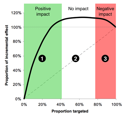
Zone 1, (the green stripe), consists of the people we can affect
positively—the Persuadables.
If we could identify them perfectly, this would be a straight line,
that comes to an abrupt halt, but with any real model, the best we
can do is identify them probabilistically, hence the curve.
Obviously Zone 1 is where we spend money to make money---a reasonable
proposition.
Zone 2, the white stripe, is all the people who are largely
unaffected by our action—a mixture of the Dead Certs and Lost Causes.
Here the line would be perfectly horizontal if we could identify
these groups with certainty.
In Zone 2 we spend money for no appreciable return.
Zone 3, red, is the group where we have a negative effect—the
Boomerangs if we're selling things, and the Sleeping Dogs in a retention
context.
This is the disaster zone, in which spend money to drive away business.
There is no rational case for targeting here.
Moving to this slightly more nuanced view, where we deal in probabilities
rather than known outcomes,
we can recast anyone whose probability of purchasing is increased
by our action as a Persuadable;
those whose purchase probability is largely unaffected as an
Unshakable, and those whose probability of purchase is reduced
as a Boomerang.
The trouble with conventional so-called “response” models is that,
despite their name, they don't model response at all:
they model purchases pure and simple: they don't look at
the untreated population in the model-building process.
So it's not that they simply conflate the Dead Certs with the
Persuadables: they will actually also tend to recommend targeting
people whose likelihood of purchase is reasonably high if treated,
but even higher if left alone.
Quite simply,
“response” models aren't: they model the wrong thing.
In future posts, I'll discuss how we might go about segmenting people
for real, and how we might model the change in response probability
(the uplift) to allow us to target on that basis.
Labels: response, segmentation, text, uplift

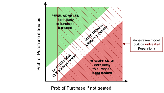
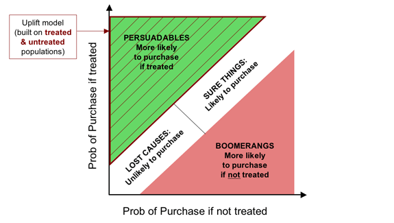
![The soft form of the Fundamental Campaign Segmentation for Demand Generation. The horizontal axis shows probability of purchase if not treated, while the vertical axis shows the probability of purchase if treated. The diagram shows four segments,
- Persuadables (top left) [more likely to purchase if treated];
markedly when treated;
- Lost Causes (bottom left), [unlikely to purchase];
- Sure Things (top right), [likely to purchase]; and
- Boomerangs (bottom right), [more likely to purchase if not treated].](http://farm1.static.flickr.com/145/410223243_8bc2562eb9_o.png)

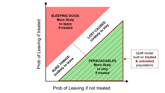
![The soft form of the Fundamental Campaign Segmentation for Retention. The horizontal axis shows probability of leaving if not treated, while the vertical axis shows the probability of leaving if treated. The diagram shows four segments,
- Persuadables (bottom right) [more likely to stay if treated];
markedly when treated;
- Lost Causes (top right), [unlikely to stay];
- Sure Things (bottom left), [likely to leave]; and
- Sleeping Dogs (top left), [more likely to leave if treated].](http://farm1.static.flickr.com/120/410223480_15f744a931_o.png)