Improving the Journey History on the Oyster Website
If you travel by tube in London any significant amount at all, you probably have an Oyster card. It's a pretty fantastic system: it's easy, it's reliable, and it's much cheaper than paying cash fares. You can register your card so that tops up by direct debit whenever the balance falls below some threshold amount, and if you do that (a) you obviously never find yourself unable to travel, and (b) get to see your journey history online, which can be useful for various reasons.
Unfortunately, the online journey history features some of the worst presentation of information you are ever likely to see. Here is my journey history for March.
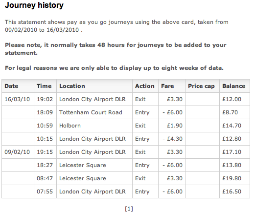
If you can be bothered, stare at it till you figure it out. Or don't. Here is how I would present that information (in a table, using text of the same font in the same size).
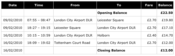
I think this would be clearer and better for very nearly everyone who looked at the information.
I suspect that what has happened is that whoever designed and implemented the system decided, for whatever reason, to make the table represent the underlying data in the Oyster system as closely as possible. This could have been through laziness or ignorance, but could have been a conscious decision, perhaps based on a belief that this directness would have benefits. But the result is a disaster for comprehensibility and clarity.
I hope it will be immediately clear why I think this is a better layout, but I will list the reasons anyway (partly because I'm hoping someone from Oyster or LRT will read this and make changes).
- The far of a journey is shown. Incredibly, none of the numbers in the Oyster table is actually a fare in the sense that almost everyone would understand it.
- The opening and closing balances are shown clearly.
- There are no confusing negative amounts.
- Time runs forwards down the page, as is conventional and familiar, e.g. from bank statements. (I accept there is an argument for reverse ordering; I think it is weak, but if you made the other modifications and left the reverse ordering, I still think you would achieve 90% of the benefit.)
- Journeys occupy a single line.
- It doesn't use the extraordinary convention of labelling the column 'Fare' but then making negative amounts costs and positive amounts credits. (It's true that accounting conventions usually make debits negative and credits positive, but in these cases the column is usually labelled 'Amount', not Cost (or Fare). A negative fare is a credit or refund.)
Obviously this design requires a litle more width than the current layout, but I don't believe it is so wide as to cause a problem, weighing in at around 600 pixels against the current 520 or so. If width is a major consideration, text could be wrapped in the "From" and "To" sections and even in the time columns, but I don't believe to be necessary.
Clearly, my short transaction history does not represent the full complexity possible. In particular, the current design features a price cap column, there is the possibility of people registering an entry but not an exit, and late-night journeys may span midnight. I'm sure there are other possibilities too.
I contend that whatever such complexities might exist, it is extremely poor design to overcomplicate the presentation of the common case for the sake of accommodating the rare cases uniformly.
In the specific cases identified, I would suggest the following, though better solutions may be available.
Entry without Exit
Show the entry date, time and station; leave the exit time and exit station blank or (better) show "(no exit recorded)" in the To column; show the actual cost applied as the fare (£6.00?)
Capped fares
Just show the fare applied. If there is a pressing need to indicate that it was a cap, add an asterisk to indicate this. If there is a really pressing need to indicate the size of the saving, either add a column for this or make the fare clickable or add hover text to show the uncapped fare. (My feeling is that people don't need to see the capping information. If you are keen to emphasize the saving, perhaps add a note under the table indicating the total saving from fare caps.)
Journeys spanning midnight
Just put the entry date; I think people will figure out that a journey from 23:30 on 16/3/2010 ending att 00:10 probably took 40 minutes rather than the alternative possibility of having spanned a negative time period.
Why blog?
Why am I blogging about this not just mailing Oyster? Well, there are couple of reasons. The first, is that I tried to mail Oyster through their website. After establishing that my feedback related the website, I was taken through a long and complicated form that included mandatory fields for my date of travel, my approximate time of travel (to the nearest minute), my Oyster card number and much more besides. All this I cheerfully provided, meaningless though it was. I was then presented with an input box perhaps 40 characters wide and 3 lines deep in which to share my deepest concerns with Oyster.
Rather amazingly, the painful inadequacy of my box turned out to be a benefit, because it caused me type the message in an editor and then paste it in. This was good, because on finally clicking submit I was met with
500 INTERNAL SERVER ERROR
(almost suggesting a buggy website).
But I confess that I was considering blogging anyway, not to "name and shame" Oyster, who on the whole I think provide an excellent service to Londeners and others; but because while poor information design is all around us, presentation as poor as this is rare, and perhaps does serve as a good illustration of how simple changes can move something from virtually incomprehensible to pretty clear. (Though, as they say, your mileage may vary.)
Labels: data errors, tables, visualization
posted by njr at 18:31 PERMALINK
![]()